This portfolio
The site you're on; a place to showcase my projects, park my thoughts, and display who knows what else. Not your typical purple gradient slopsite.
Background
This site has been through quite a few different phases; most of which I'd rather forget about... 😓
For my newest redesign, I chose to go against all societal expectations. Instead of creating another purple gradient site, a modernist white box hell, or a disingenuous serif-font site, I thought to myself, what's a design pattern everyone's ignored on the web?
Enter, the Bauhaus.
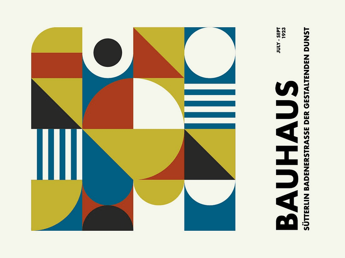
The Staatliches Bauhaus, commonly referred to as the Bauhaus (German for 'building house') was a German art school active in the early 20th century best known for starting the Bauhaus movement, a design philosophy defined by the belief that "form follows function".
What does that mean for this site?
It means the decoration is the structure.
Goodbye, drop shadows!
Au revoir, gradients pretending to be light!
Sayonara, border radius!
Everything you see is a flat plane, a primary colour, or a piece of type doing a job.
The colour-shape law
In 1923, Wassily Kandinsky, who taught the Bauhaus's preliminary course, sent round a questionnaire with three outlines on it: a triangle, a square, and a circle. Fill each one in with red, yellow, or blue. The answers that came back became one of the school's signatures:
triangle = yellow
square = red
circle = blue
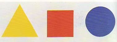
I took that literally. Every major heading on this site ends in a full-stop that isn't a full-stop — it's the Kandinsky shape matching that page's colour. /blog is yellow, so its title ends in a triangle. /work is blue, so it ends in a circle. The hero cycles through all three, constantly, because it can.
The same law runs down through the small stuff: the eyebrow labels over sidebar sections, the markers beside list items, the three shapes sitting next to the wordmark up top. If you ever catch a yellow square on this site, it's a bug.
The one place it breaks down is the page you're reading.
Every case study carries its own tint. This one's a violet, TeachAssist's a sky blue, Guess Who's a magenta... and a colour from outside the trio has no shape it agrees with. So on these pages the shape carries the meaning the colour stopped carrying: a square marks the kind of project, a triangle marks a stat or a highlight.
Type as structure
Two faces, and they don't share work. Bauhaus 93 does every large uppercase heading and every watermark. Poppins — geometric enough to stand beside it without arguing — carries every word you're actually reading.
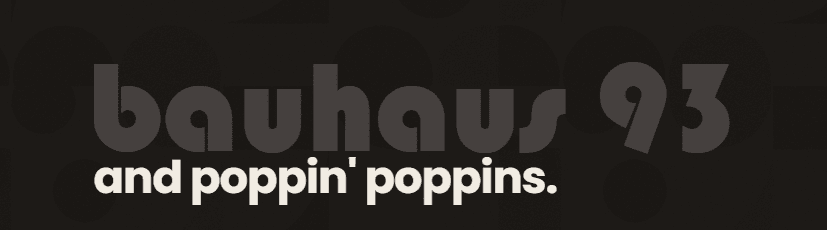
The watermarks are the part I like most. Behind almost every section heading there's an oversized lowercase word - "developer", "work", "about", whatever. Big enough to be architecture, faint enough to read as texture instead of text. It's the closest thing this site has to a background image, and it costs nothing to ship.
Headings are clamp()ed rather than stepped through breakpoints, so my name in the hero rides one continuous curve from a phone to a 4K monitor instead of snapping between four fixed sizes.
Two themes, one identity
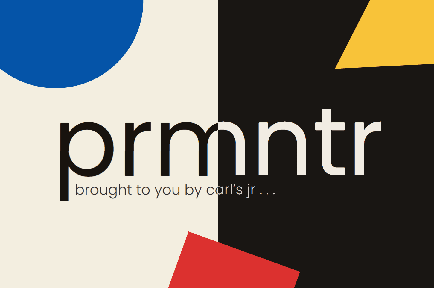
Cream paper, black ink, and the three primaries.
The problem is that the colours that sing on cream go muddy on charcoal. So dark mode gets its own dialled set: red and blue both lifted in lightness, the button blue deepened separately from the theme blue because the theme blue was too light to hold white text, and the border colour dropped to 22% opacity - tiny samples of pure-ish white does not contrast well with dark tones!!
Mechanically it's one attribute. data-theme on <html>, persisted to localStorage, applied by an inline script that runs before first paint so there's no flash of the wrong theme. Deliberately not the .dark class, for reasons that show up two sections down.
Motion
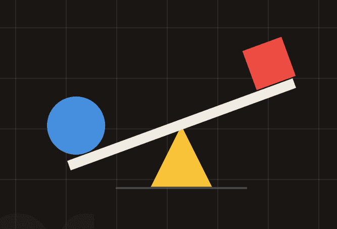
Framer Motion for the signature moments — the hero shapes pop in, glide into formation, and settle into a seesaw rocking on a triangle fulcrum; headings use Kandinsky shape-periods; section reveals are scroll-linked, and the name and the watermark behind it drift apart on parallax as you scroll off the first screen. Lenis adds inertial smooth-scroll over the top.
I'd add faces to them, but that's a little too whimsical, even for me.
So far, so good.